Distributing EF Class across all Apple platforms with Mac catalyst
Over the years Apple has released devices with different screen resolutions across the iOS platform – both iPhone and iPad. As a natural response, product teams adapt their apps to surface the newest updates and be on top of the latest technologies.
EF Class was no exception. Over the years we adapted the iPad app to respond to 12.9, 11, and 10.2 inches so we could support our teachers and students in whatever operating system or screen resolution they had.

Mac catalyst release
With the arrival of Mac Catalyst in 2019, a lot came to the table for the entire product. We now had the possibility of sharing the same source code across platforms to efficiently convert the iPad app to desktop-class features.
For the iOS development team, this was a no-brainer and developers were ready to go ahead and get coding. However, for the product team, this wasn't a decision to be taken lightly due to the amount of resources, time, and investment required. We had to make decisions on what we would be adapting, by when, and how. However, we could all see the potential of opening new supported platforms: get more active and engaged users that could contribute towards our product OKRs and North Star (Weekly / Fortnightly / Monthly teaching teachers).
Revisiting and planning adaptive layouts, and the Mac app
The design team was involved early on in this mission and invested some time revisiting the experience for Apple devices. We understood pretty quickly that it would be easier to start by revisiting the Mac app experience, as it was very similar to the iPad app when it came to bigger screen sizes. However, we also realised that we had to adapt the entire app for mobile devices.
Together with the iOS and QA teams we mapped out a plan to convert the iPad app into an iPhone app and decided to improve the Mac app (mainly on bigger screens) later, once we had the first version released, giving us space and time to think about improvements to do.
Adapting navigation elements
Our first challenge on this journey was to adapt the teachers’ app navigation bar to mobile screens. Initially we considered reducing the number of app views for a mobile device. However, after careful consideration we opted to have all the views available so users could find a parallel between iPad and iPhone apps without a big cognitive load. We reworked the spacing and iconography to have it balanced in both iPhone and iPad apps.

iPad and Mac nav

Mobile navigation
Making navigational and hierarchical decisions
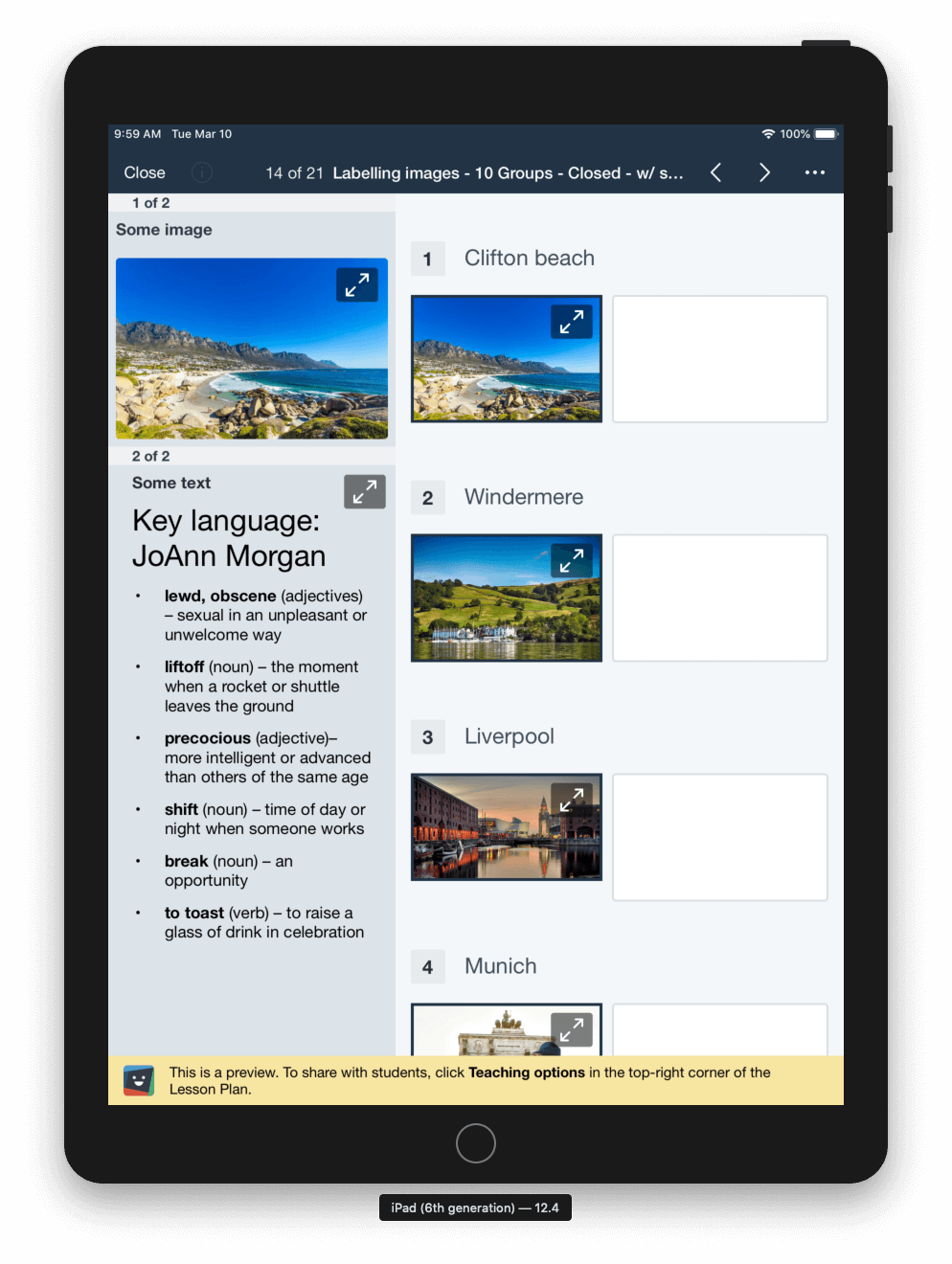
Following the navigation bars we came across views with more navigation items inside them, such as split views. A split view manages the presentation of two side-by-side panes of content, with persistent content in the primary pane and related information in the secondary pane.

In order to handle these views – and in our use case we had several - we decided to decouple the split views into 2 views: a Master view with the lessons’ list, filters and search; and the lesson plan view. When a user enters in Taught Lessons she would select a lesson from the list in the Master view, and then navigate into the Lesson Plan Overview.

Taught Lessons Master view

Lesson Plan overview
Making empty states smooth
Furthermore, we wanted to give the same informative experience to users on small screens as we do in bigger ones. When it came to empty states we felt that they needed to be adapted so all users could quickly understand the benefits of using that view, how to get started, and how to manipulate their content.
Our empty screen followed the same layout and pattern across web and iOS apps:
Icon, title, and description of the view;
Three main items with the key benefits of that view. Each item contains an illustration, title, and description;
Actionable call to action so users can start using that section as soon as possible.
When thinking about adapting these screens for a mobile device we had three options that we could take:
Keep only the title and description of the view, and remove the three sections explaining the benefits of the view.
Pros: would save space, wouldn’t have to do a lot of work;
Cons: a lot of information could be missed, and the value of the view could be missed or misunderstood by users.
Stack the three sections under each other and allow users to scroll down the page to read them.
Pros: would give users all the information they needed about the view;
Cons: could be a long scroll through the view, and, most worrying, the CTA would be at the bottom of all the sections and hidden away from users that just enter in the view.
Decouple the three sections into three individual pages that could be navigated sideways through page controls or a side scrolling gesture.
Pros:
would give users all the information they needed about the view;
would allow the CTA to be always visible and tappable;
would use a native and familiar iOS behaviour that most iOS users would know how to use;
Cons: we couldn’t see any.
✅This was our winner!

Next improvements
No feature or technical investment is ever fully finished in the product world. There is always room for growth and improvement. On the technical investment front we are looking forward to allowing teachers and students to see and use activities on the iPhone app (currently activities are only available on iPad and the Mac app).
Here are some examples of those:

Last but not least, as soon as Apple allows Mac releases, we will release our new and shiny Mac app, completing our Apple app family suite and allowing teachers and students to use EF Class at any time, anywhere.
Outcomes

With the investments in adaptive layouts the iPhone app grew in adoption and usage, and now represents 26.5% of our user composition grouped by device family.

When compared with the iPad app we can see that usage gradually grew over the initial months, and increased drastically in the later few months with the COVID-19 crisis hitting education in schools across the world.
Soon we will be able to see and compare these numbers and growth coupled with the Mac app.
Lessons learned
When it comes to optimising a product for any purpose that you didn’t foresee when it was first designed – mobile, big screens, etc. – everything needs to be taken into account and planned according to your product’s priorities.
We had to answer a few difficult questions, such as:
Which views do we have that make sense to be visible on a small device right now?
Which views do we have that need so much investment that we have to do them for a later release?
Which views don’t make sense to be viewed on a mobile phone ever?
More often than not, teams aren’t big enough to invest enough effort and time for one big and perfect release. In our case we found more benefits in iterating and delivering value on a regular release basis rather than putting months of design and development work on the line.
Internally we felt accomplished on a weekly basis every time we saw our work being pushed into a new app release, and we can see the potential of usage increase down the line by opening the app to iPhone and Mac users.
Date: March, 2020
Product: EF Class
iOS Developer: Stefan Ceriu