Content Performance
Engagement is a big buzzword for professionals when dealing with content. Whether creating, editing or publishing, professionals have a common goal to engage readers with the content they are working on. In the digital world of the web this is quite a demanding but also difficult aspect to measure correctly.
The problem is that there are several ways to analyse it and little consensus among the industry on how to best do it. Analytics and machine learning is one of Fospha’s main focuses as a business, and this need to answer the problem of engagement on efficiently was the starting point of Content Performance.
It aims to create a single portal for anyone that creates, edits, or publishes content to view and keep track of both real-time and historical content performance metrics over time.

The engagement metric is calculated based on a data-driven algorithm designed by Fospha’s data science team to best measure and quantify the level of user engagement of a website/web page. It is measured on a scale of 0 to 100 by combining three components, each describing a different aspect of a user’s interaction with a web page. These three aspects are:
the quality of the user’s interaction with a web page - did he spend in the page, what did he read and clicked;
the probability that the user is in fact present at a given moment in time - was there any absence of interaction, and a long waiting time? ;
the percentage of the current web page that the user has likely been exposed to - where did the user scroll to and navigated from and to;
These three components serve the underlying basis of the Fospha engagement score algorithm.

This product was developed and launched before I was part of the team. When I joined my expertise was brought into the product so there could be a restructure and reorganisation of the product’s user experience and interface.
Due to the lack of these skills during the first version, the product was missing some care and attention to detail in these areas. Getting accurate data from the tool was hard and the app was hard to interact with.
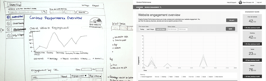
As a starting point I reviewed the user interface and cleared all the UI elements that didn’t work correctly so there could be a quick win both for the team and the users. Running at a fast pace and in parallel, user research was carried out in order to understand our user’s goals and needs when it comes to engagement, areas that were previously lacking in attention from the team.
Through user interviews and surveys all doubts were removed and the user’s interests became a lot clearer. Personas were created based on the people we talked with to guide the team during the project and there was now more space to change the product based on facts and research.

Wireframes and clickable prototypes were created and tested so we could validate our initial thoughts and design approaches with our users from the outset. With the development and data team’s help all the functionality and product interactions were refined and studied so we could answer the engagement issue with a very simple and visual solution. The user interface was refined and redesigned which made the tool look more elegant and simpler than before, improving the tool ahead of bringing more users and attention to the product.
Date: November 2015
Product: www.fospha.com